📐 CSS Angles with G.C.S.E Trigonometry
At work last week, we started building a cool new project and part of the design revolves around angles. A particularly tricky part is angular-cropped images. The images need to have a 8 degree angle top and bottom to give a skewed look–however the image cannot be distorted.
Here's an example of what we want:
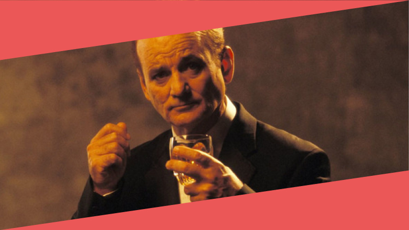
Some other points worth mentioning are that the images can be any size and in any width container.
After quickly abandoning my initial attempt with transform skew, I reached for the clip-path property. Clip path accepts a polygon value, which you can create with some 4 lots of 2 percentage coordinates. I like to use a web app called Clippy to quickly test out polygons so I knocked up a quick example:
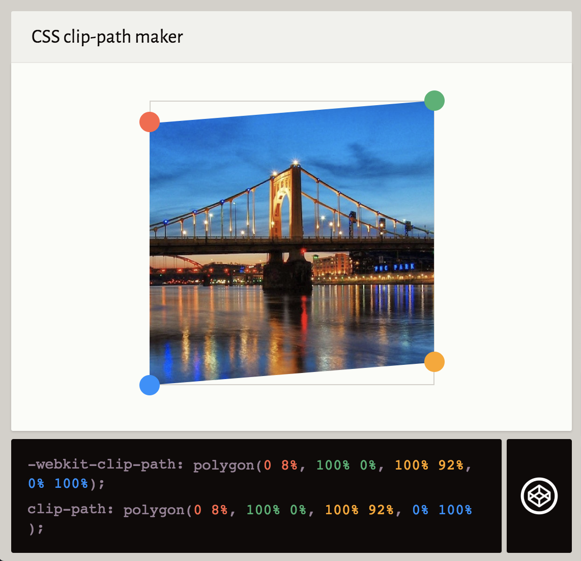
This uses the follwing CSS which kind of makes sense but it actually doesn't work.
clip-path: polygon(0 8%, 100% 0%, 100% 92%, 0% 100%);The issue is, if the image proprtions change, the angle is going to change. Basically we need to work out the sides of a triangle when we only know 2 angles. Like this:
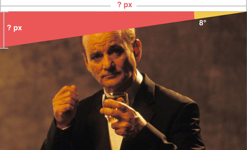
One thing we can know though, is the aspect ratio of the image. For example the image we've been using is 16:9. Therefore we could add those measurements in and see if it helps us. As the clip-path will be in percent, we can scale it all up after.
Now we have a triangle where we know 1 side (16 width) and one angle (8°). Digging out my old maths textbooks, I can confirm that we need to use some GCSE trigonometry. To be specific, the phrase SOH CAH TOA.
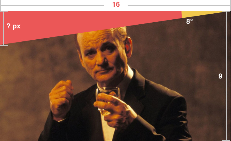
Effectively, this is mnemonic to remember the 3 ways of working out the sides of a triangle, based on the information you have. We have the Opposite angle (8°) or O, the Adjacent side (16 wide) or A. O and A means we need to use T (Tan). Using the formula Tangent = Opposite / Adjacent (TOA). Algebra time...
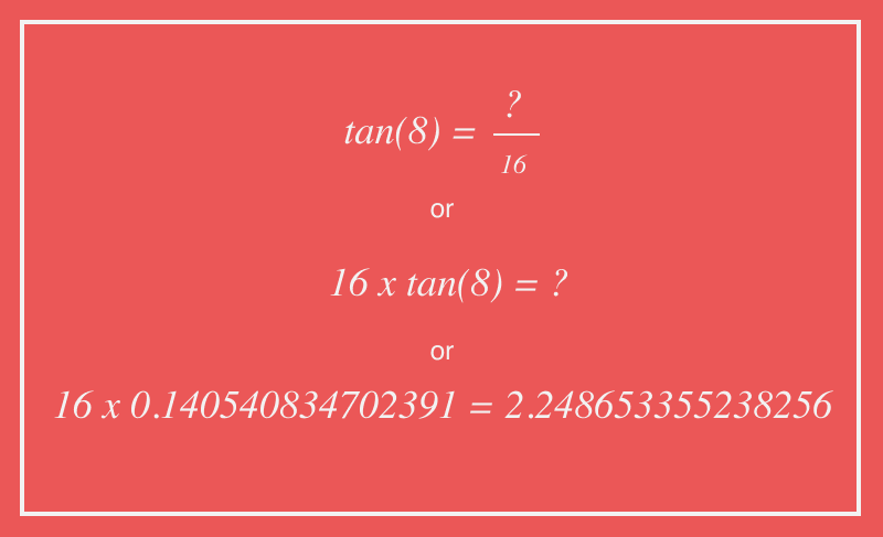
That shows the other unknown side of our triangle is 2.248653355238256 in length. This doesn't solve our clip-path issue by itself. First we need to get this as a percentage of the whole length of the vertical side (9).
So, to work out the top angle, we need to divide this by 9 and multiply it by 100%:
tan(8deg) * 16 / 9 * 100%For the bottom angle, we need to reverse it by taking it away from 100%:
100% - (tan(8deg) * 16 / 9 * 100%)Unfortunately CSS (or any of it's preprocessors?) don't have native trigonometry functions. However, someone already made them! Take a look at the post Trigonometry in Sass. By adding these functions into our code, we can then use the functions in our SCSS. Here's our final clip-path for our 16x9 image:
clip-path: polygon(0 #{tan(8deg) * 16 / 9 * 100%}, 100% 0, 100% #{100% - (tan(8deg) * 16 / 9 * 100%)}, 0 100%);And here is a Codepen showing the same applied to 16:9, 4:3 and 3:4 aspect ratio images (I'm using Intrinsic Ratios/Uncle Dave's Ole Padded Box to maintain the images' aspect ratio):
See the Pen Trigonometry Image Skew by matthew jackson (@matthewbeta) on CodePen.
Hope that didn't fry your brain like it did mine.